Built-in themes
The built-in themes are sorted by what the document is, not by how it looks. Each carries its own palette and its own layout — body width, heading system, callout shape, tab shape and table rules all differ.
Or put it in the source file so it travels with the document:
--theme overrides frontmatter. The command line is the intent of this one compile; frontmatter is how the document usually looks. A one-off intent should win.
An unknown name reports DOC-106 and falls back to default, still producing output: a wrong theme only affects how it looks; the content is fine.
At a glance
This table is generated from the theme registry, not copied from it: every row is the theme's own one-line description, the same record the DOC-106 diagnostic prints — the diagnostic prints the Chinese side of it, because compiler diagnostics are Chinese-only (ADR-0047).
| Theme | What it is for |
|---|---|
default | Anything: GitHub's neutral palette, the least likely to compete with your content |
minimal | Short pieces and one-pagers: black, white and grey, a narrow column, serif headings, generous whitespace |
tech-dark | Technical content, dark by preference: monospace headings, sharp corners, a cyan accent |
editorial | Formal proposals: a large serif display, numbered sections, hairline rules — a magazine spread |
console | Runbooks and dashboard docs: monospace throughout, dense, status colours — a panel you keep an eye on |
paper | Research notes: a narrow column with margin notes, numbered headings, square corners — a paper |
fiction | Novel chapters: a narrow column, first-line indents, no gap between paragraphs — set for continuous reading |
manual | Technical docs: code blocks lead, sticky table headers, zebra-striped long tables |
prd | Product requirements: one numbered requirement per section, acceptance checklists, constraint cards |
architecture | System design: the widest canvas for diagrams, block quotes as decision records, booktabs for trade-offs |
blueprint | Detailed design: three-level numbering, tight field tables, monospace headings — density first |
incident | Incident reports: steps become a timeline, danger outranks everything else, an impact table |
lesson | Teaching notes: a warm narrow column, serif body, monospace eyebrows, asides on a hairline rule |
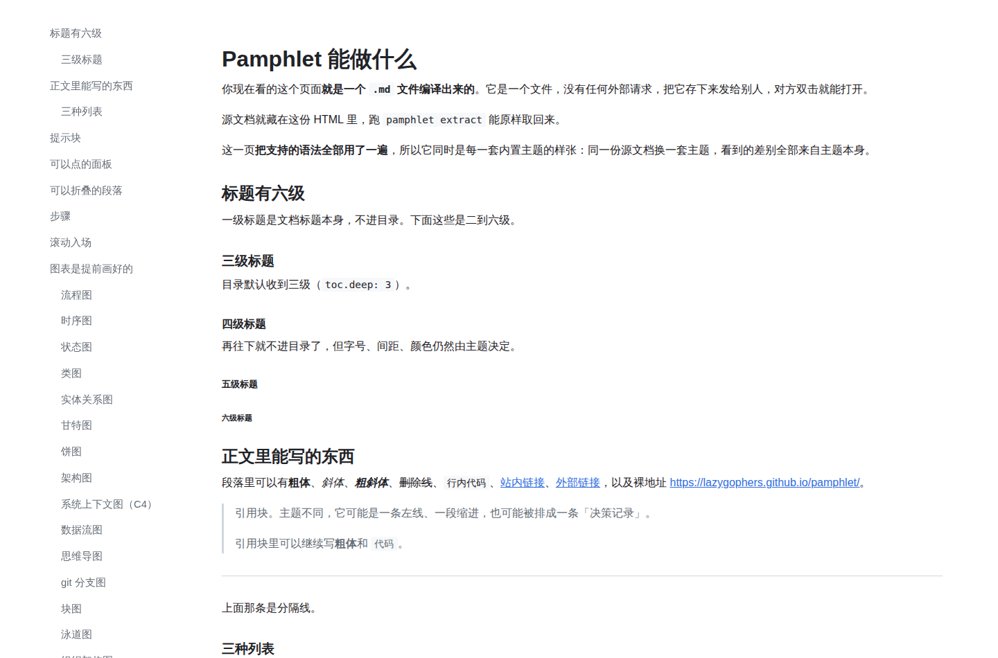
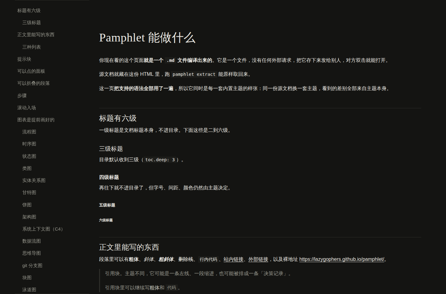
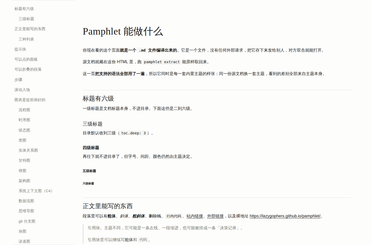
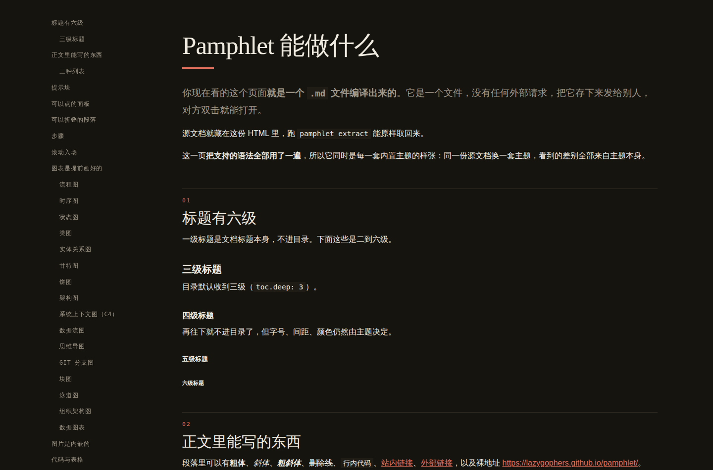
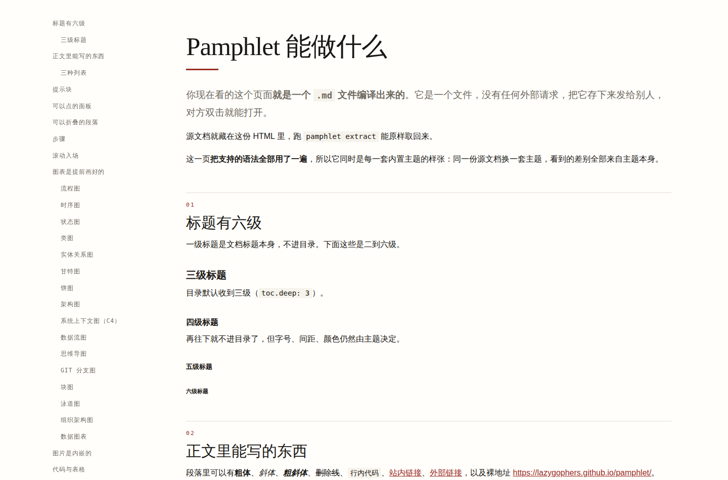
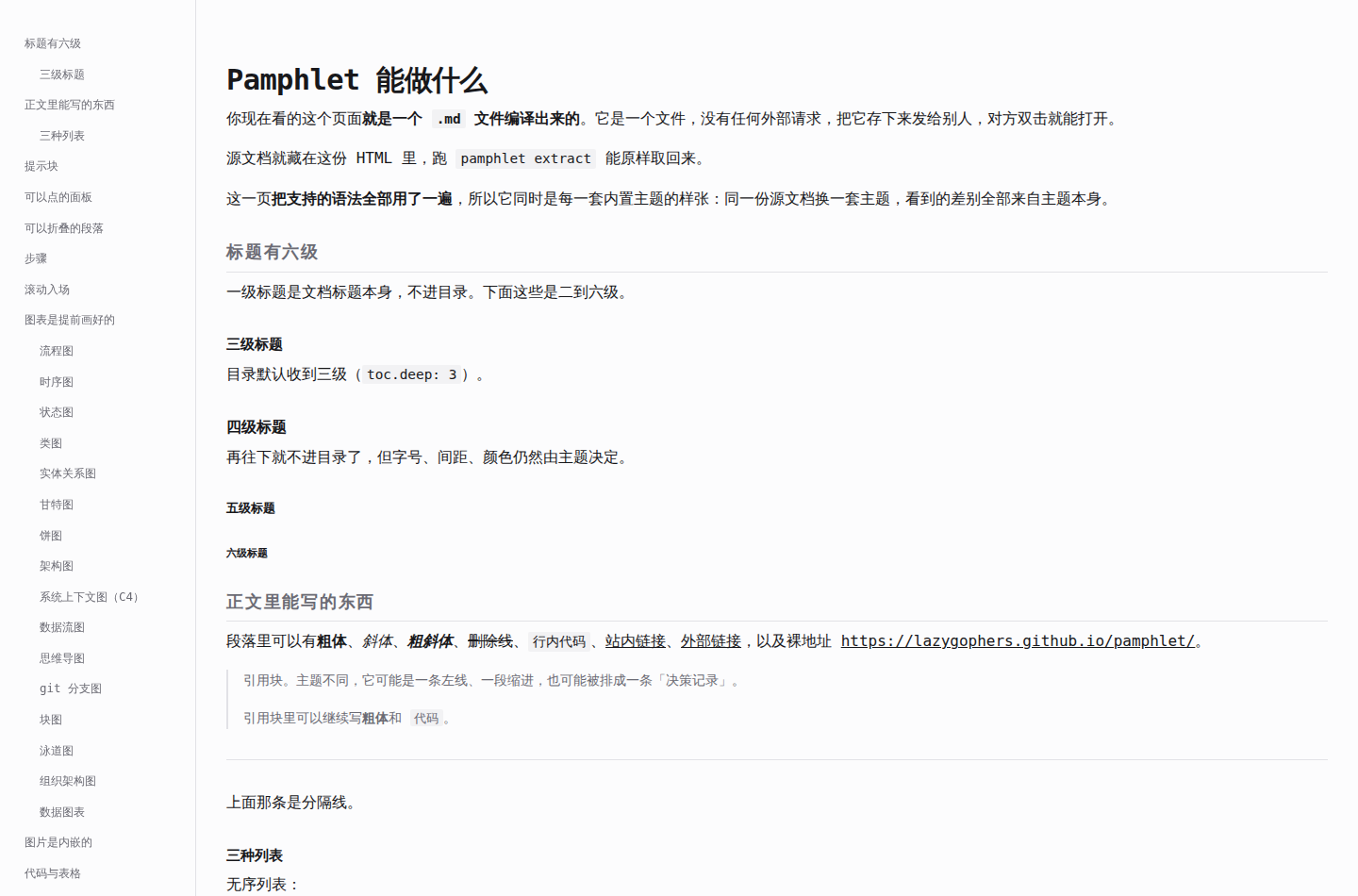
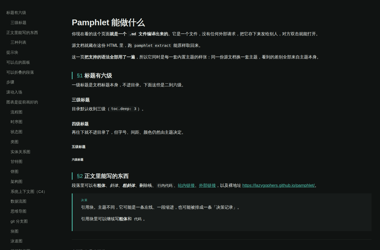
Each theme below has two screenshots and a full sample you can open. The two are on screen (dark — the output's default, regardless of the reader's system setting) and printed (light, the one exception). All three come out of the same real compile of the same source file, examples/demo.md — so every difference you see comes from the theme itself.
A screenshot cannot show you whether the tabs click, how a collapsible opens, or whether the side menu follows the scroll: open the sample for those.
default
Neutral. It is the fallback, so it is the hardest to get wrong and the least likely to compete with your content.
On screen

Printed
minimal
Black, white, grey and one hairline. A narrow column, generous whitespace, serif headings, square corners. Callouts shrink to a rule plus a small label.
On screen
Printed
tech-dark
Monospace headings, sharp corners, a cyan accent, the `##` marker shown before the heading. Callouts are filled blocks with a coloured top rule.
On screen

Printed

editorial
A magazine spread. A 3.2rem serif display, `01` `02` section numbers, masthead-style tabs, pull quotes framed by rules, tables with rules only top and bottom.
On screen
Printed
console
A panel you keep an eye on. Monospace throughout, a ruled sidebar, bracketed callout labels, segmented-control tabs, dense tables.
On screen
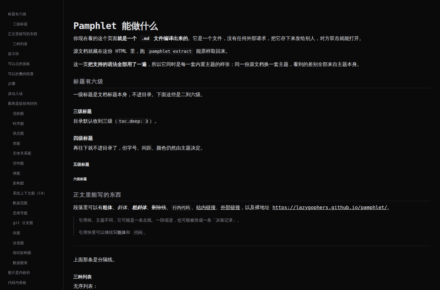
Printed
paper
A paper. Serif body, `1.` `2.` numbered sections, italic third-level headings, callouts as margin notes, booktabs-style rules.
On screen
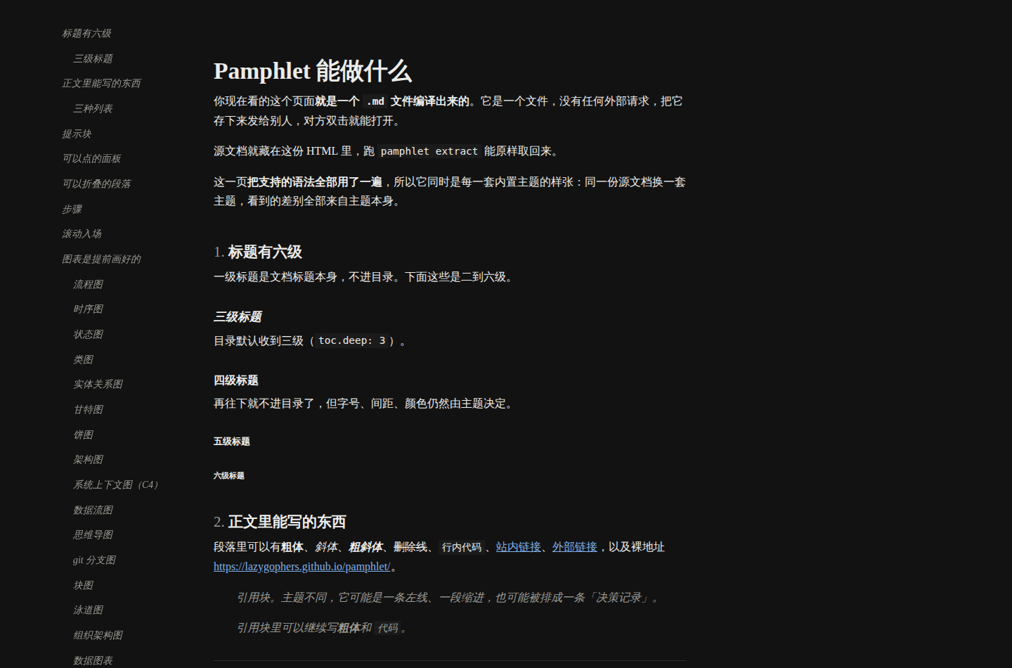
Printed
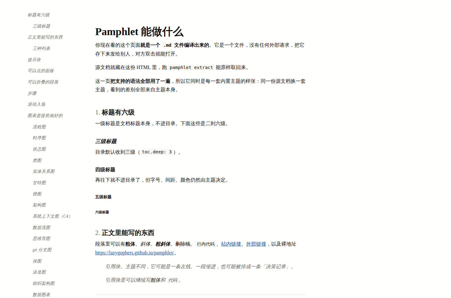
fiction
Set for continuous reading: a narrow column, first-line indents and no gap between paragraphs, a drop cap, and scene breaks as centred dots. Callouts become authorial asides.
On screen

Printed

manual
Code blocks lead: a coloured rule down the left and more padding. Sticky table headers and zebra striping for long tables, folder-tab switching.
On screen

Printed
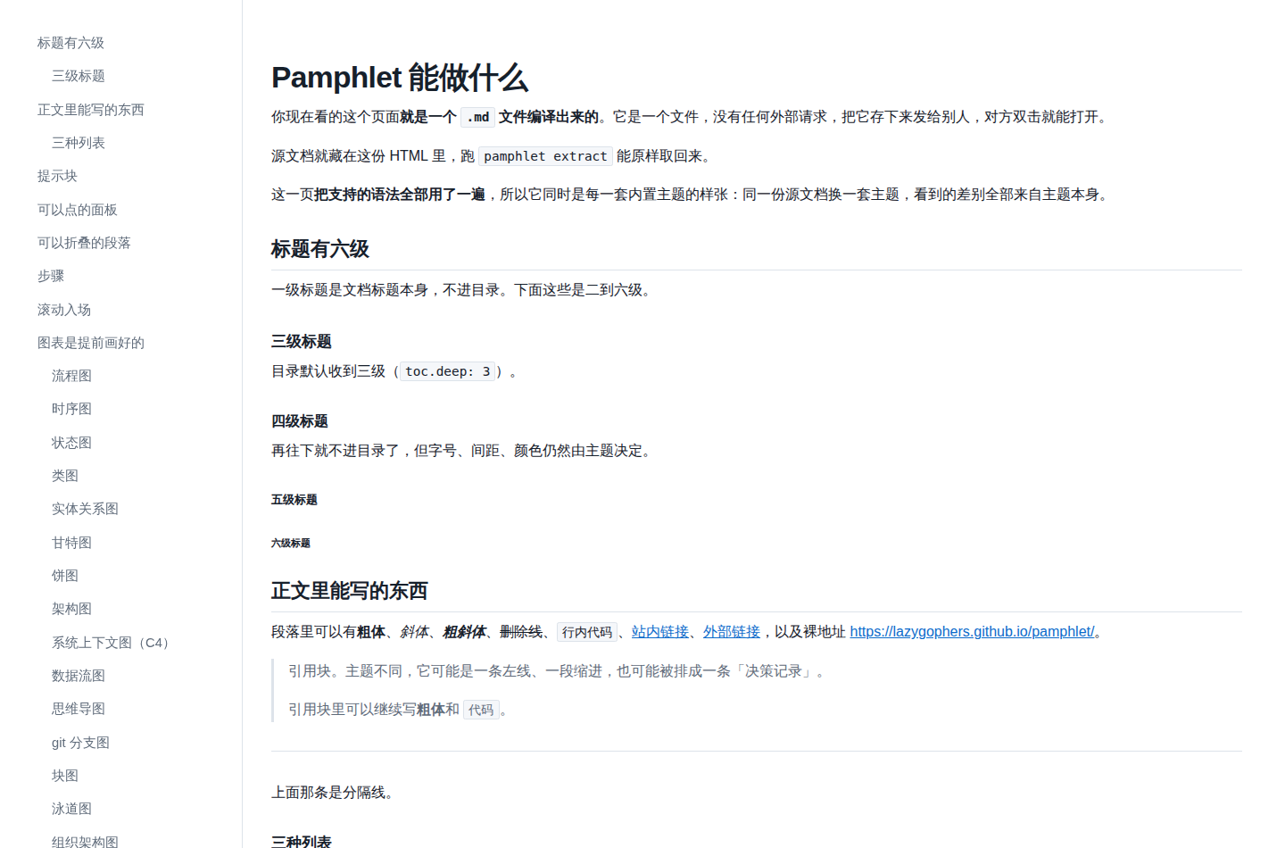
prd
Every second-level heading is a numbered requirement with an `R01` badge. Acceptance lists are real checkboxes, callouts become constraint cards, tabs are pill segments.
On screen

Printed
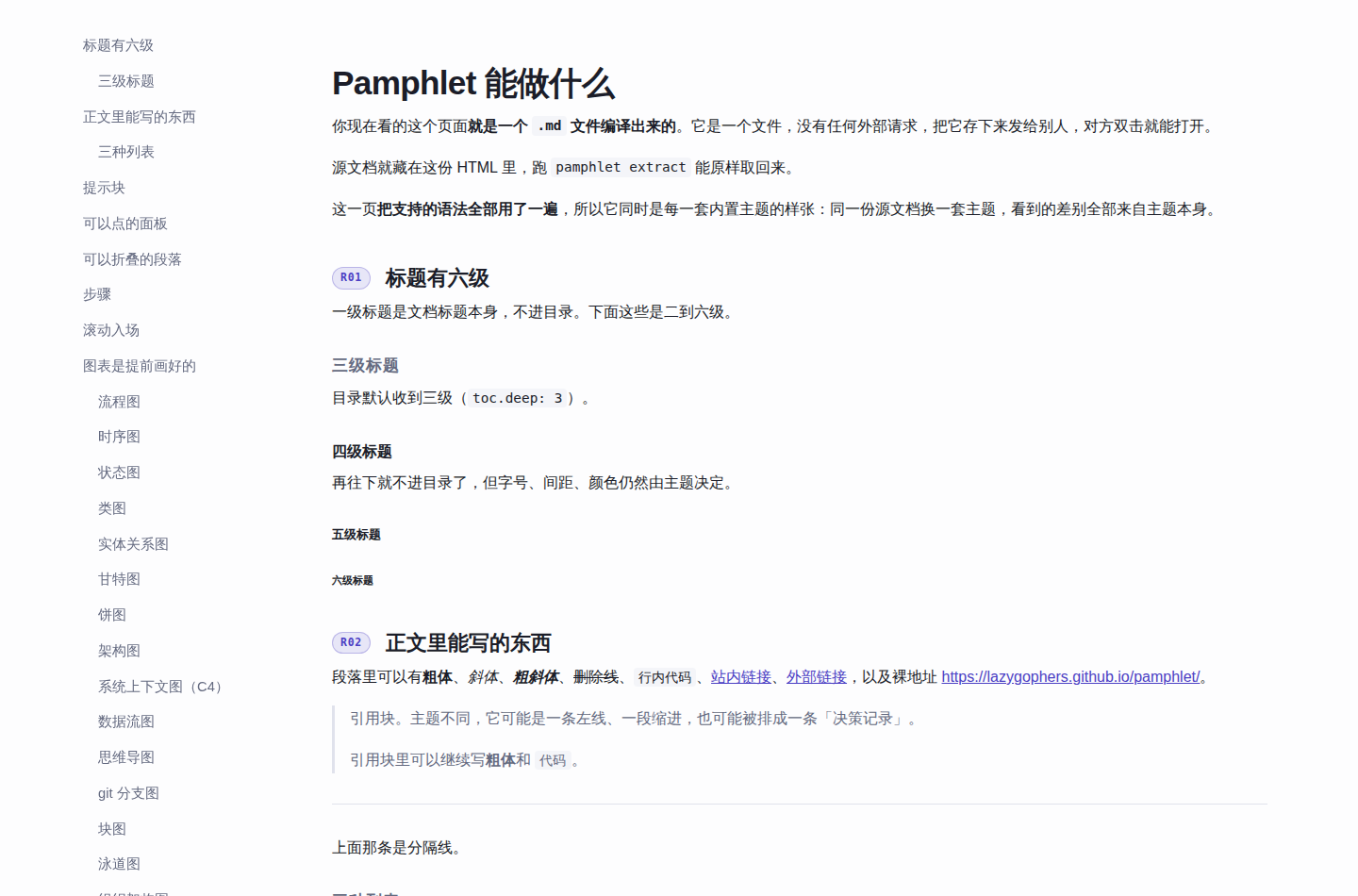
architecture
Diagrams get the widest canvas (94rem) and a frame. Block quotes render as decision records, tables are booktabs, headings carry a `§` number.
On screen
Printed
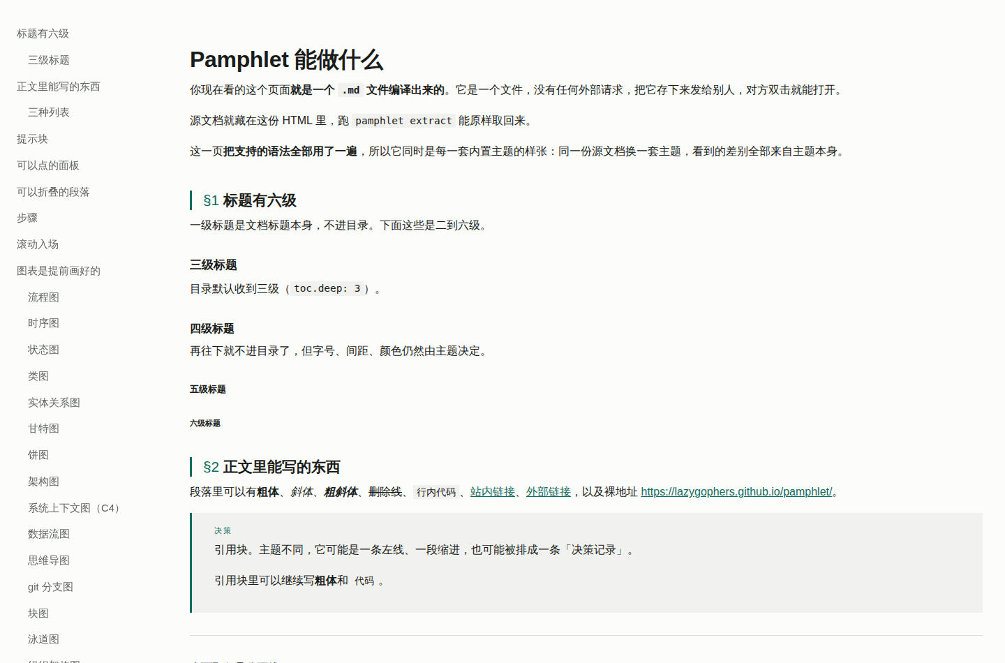
blueprint
Density first. Three-level numbering `1` / `1.1` / `1.1.1`, monospace headings, tight field tables — for the person implementing it line by line.
On screen
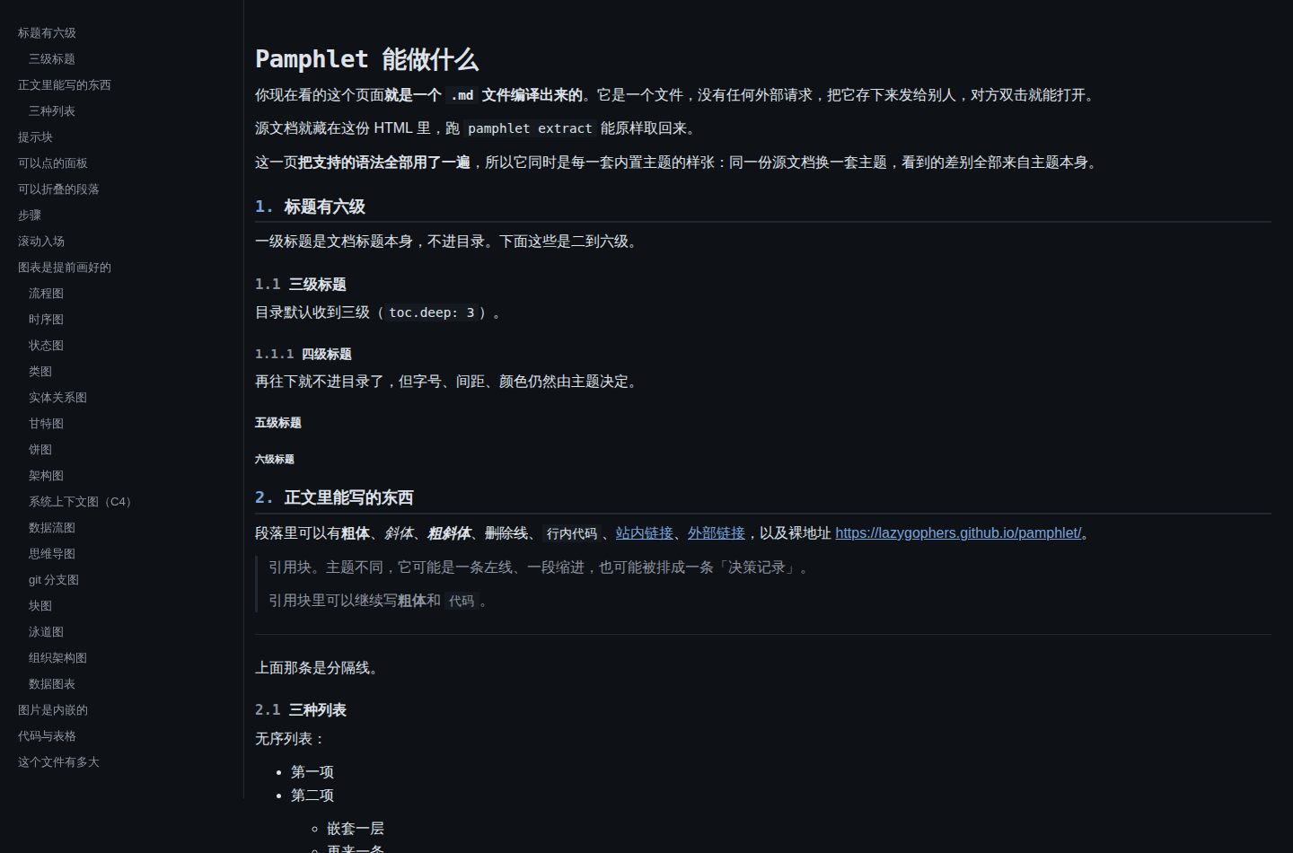
Printed
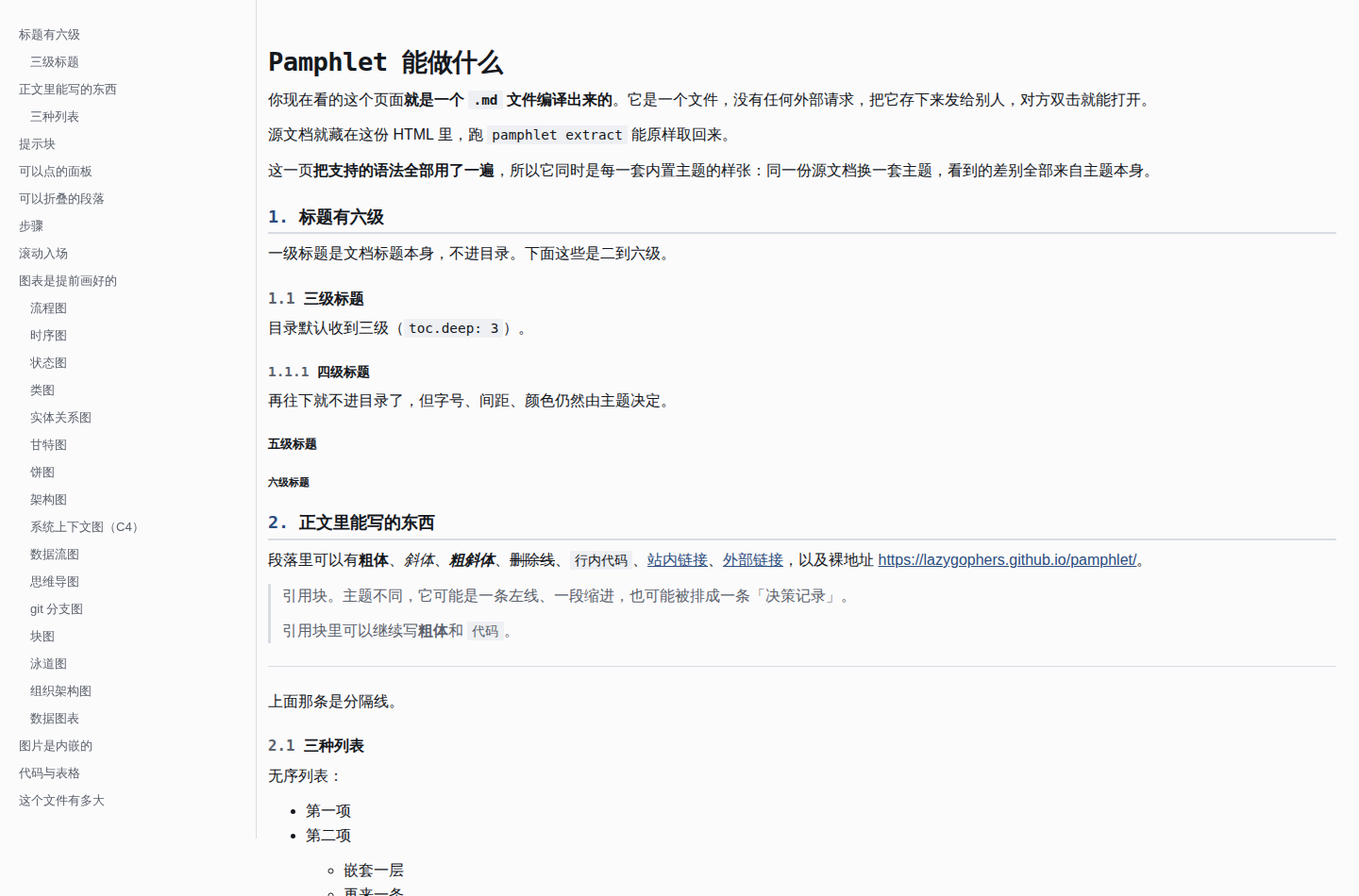
incident
Steps become a timeline (a rule with red nodes). The title carries an "incident report" eyebrow, `danger` outranks everything else on the page, and the impact table reads at a glance.
On screen
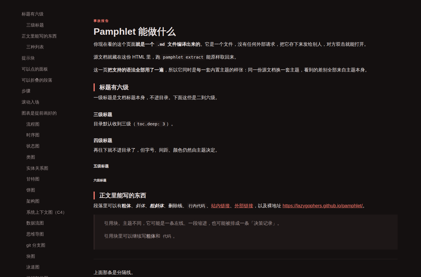
Printed
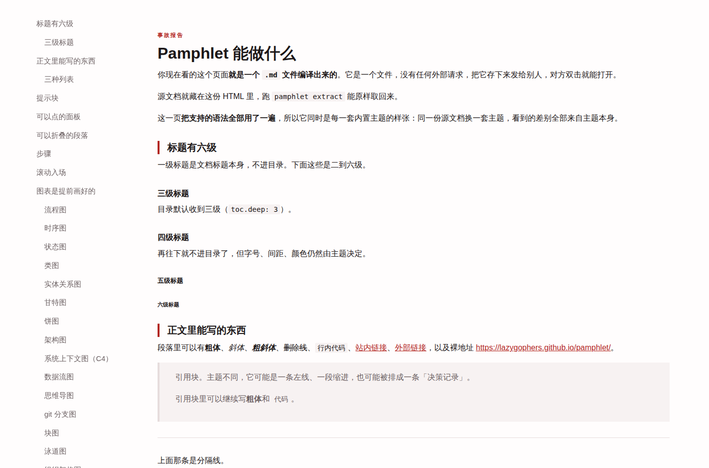
lesson
A lesson handout. A 46rem column, serif body, and a small uppercase monospace eyebrow under the title. Callouts shrink to an aside on a hairline rule (except `tip`, which becomes an outlined key box); tables keep horizontal rules only, with small uppercase monospace headers.
On screen

Printed

Every theme holds the same line
A theme may change the layout, but these four apply to every one of them alike, pinned by browser-level tests per theme:
A new theme has to pass all four — the tests iterate the theme list, so adding one covers it automatically.
The side menu
The table of contents is a sticky side menu by default, pure CSS with no JavaScript:
Below 60rem it falls back to the top of the document. To keep it inline, write toc: { position: top } — see the frontmatter reference.
Tweaking one thing
To change a colour or two rather than swap the whole theme, see Changing the theme colours. The two combine: pick --theme paper, then override --pf-primary.
All 18 semantic and 16 element tokens are in Theme tokens.
Source: ADR-0046